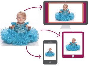
The word Responsive, itself suggest a technique for providing flexible UI for different view-ports. The Responsive Design allows designers or developers to build website that adapt to every screen size, in result, it should responds to the needs of the users and the devices they are using. Adapting Responsive Web Design, developers or designers will get a strategic solution for performance issue, starts from excessive downloads of images, JavaScript and CSS and HTML. The main advantage is – the layout changes based on the size and capabilities of the device.
For example – on a phablet, users would see the content with a single column view, on a tablet, it might show the same content in two columns and on a lappy, the same might show in more than two columns.
But, let me think, why I am discussing the above stuff… 😐
Probably, I should give an example, what exactly I am going to represent here.
The above image specifies, one image in three different view-port. Here, the same image has been represented in 3 different sizes.
To get the above output – the developer/designer might have to write the following code –
<!DOCTYPE html>
<html>
    <head>
        <style>
            /* For wider screen */
            body {
                background: url('images/abc.jpg') no-repeat;
                background-size: 1400px auto;
            }

            /* For ipad */
            @media only screen and (min-width: 480px) and (max-width: 768px) {
                body {
                    background: url('images/abc.jpg') no-repeat;
                    background-size: 700px auto;
                }
            }

            /* For iphone */
            @media only screen and (max-width: 479px) {
                body {
                    background: url('images/abc.jpg') no-repeat;
                    background-size: 300px auto;
                }
            }
        </style>
    </head>

    <body></body>
</html>
OR
If we don’t want to load the same high resolution images in all the scenarios, then we can check with the below code –
<!DOCTYPE html>
<html>
    <head>
        <style>
            /* For wider screen */
            body {
                background: url('images/abc-high-res.jpg') no-repeat;
                background-size: 1400px auto;
            }

            /* For ipad */
            @media only screen and (min-width: 480px) and (max-width: 768px) {
                body {
                    background: url('images/abc-med-res.jpg') no-repeat;
                    background-size: 100% auto;
                }
            }

            /* For iphone */
            @media only screen and (max-width: 479px) {
                body {
                    background: url('images/abc-low-res.jpg') no-repeat;
                    background-size: 100% auto;
                }
            }
        </style>
    </head>

    <body></body>
</html>
We can customize more with the above code for best view in all the scenarios.
But, what is the use of picture element here ❓ 😕
.
.
.
.
No worries 😛 – lets put some light on the picture element now, the reason why we are reading this blog 😀
The output what we got from the above code, can be done easily, using picture element.
<!DOCTYPE html>
<html>
    <body>
        <picture>
            <source media="(max-width: 479px)" src="images/abc-low-res.jpg">
            <source media="(max-width: 768px)" src="images/abc-med-res.jpg">
            <source src="images/abc-high-res.jpg">
            <img src="images/abc-high-res.jpg" alt="This picture loads on non-supporting browsers.">
            <p>Accessible text.</p>
        </picture>
    </body>
</html>
That’s it :-). Isn’t it really interesting, that with the 4 lines of code only, we can achieve the above thing easily :-). Hmmm… sounds really interesting 🙂 :).
Note: Please check here for Browser support details.
Thanks 🙂 and will be happy to listen from you 🙂 :).

Nice ! Enjoyed reading every bit of this post.
Only question is – Can’t we do this using “srcset” attribute of html “img” tag ? May be something like –
LikeLiked by 1 person
(y) we can do the same above thing using “srcset”. The only difference is – “device pixels” & “CSS pixels”. “picture” element uses device width for responsiveness, hence easier for coders to understand and implement. In other hand, “srcset” attribute uses pixel densities, hence coder find it a little tricky and confusing one. But, the main advantage of using “srcset” is – it’s part of an already existing HTML tag “img”.
Otherwise, both can be used for responsive images. 🙂
LikeLiked by 1 person